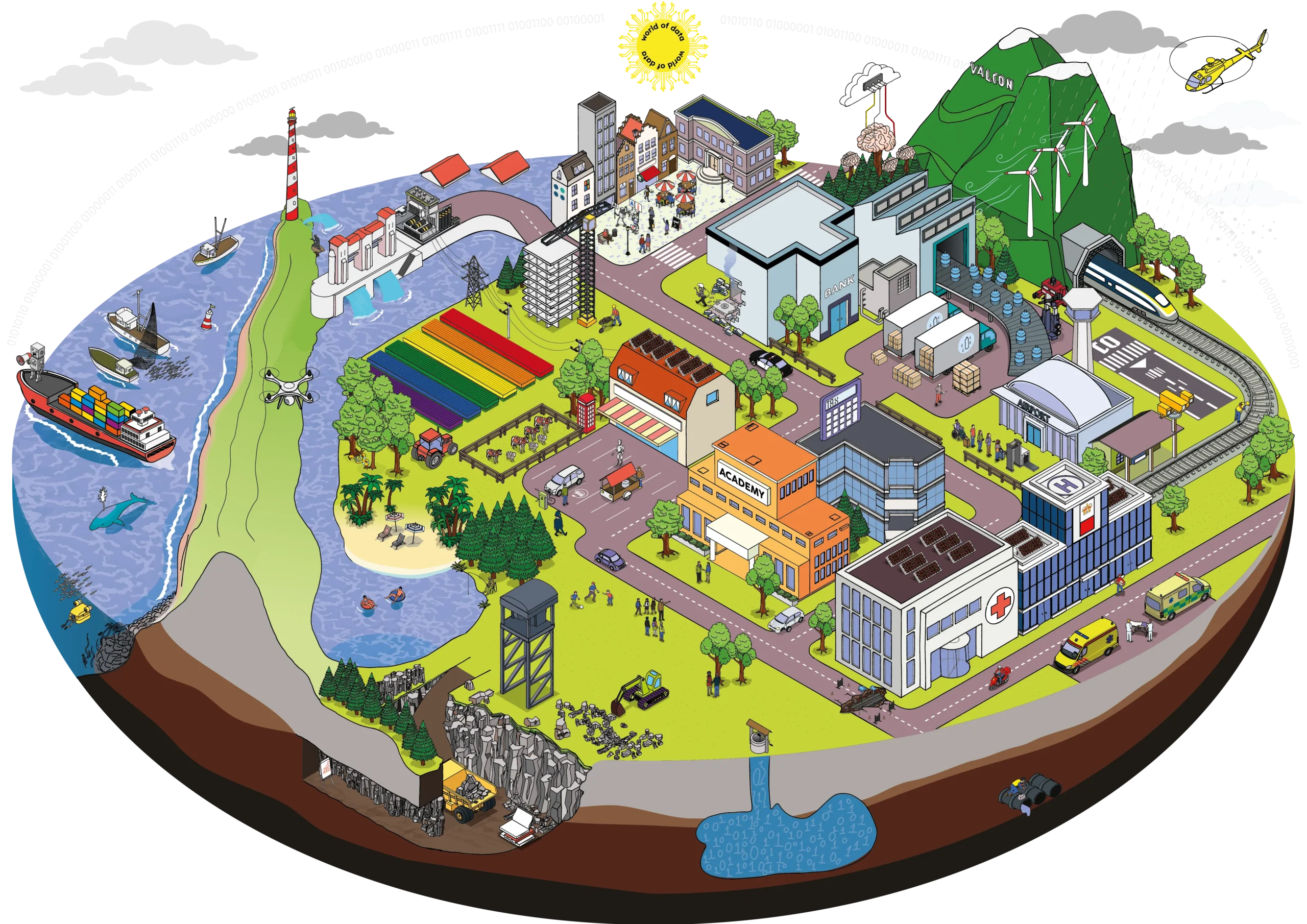
Data storytelling goes way beyond graphs and charts. It’s about turning data into a narrative, telling the story behind it that speaks directly to the audience in a clear, easy-to-understand way, so you create a memorable story that is relatable and actionable.
A good example is the climate change narrative. Take a large data set related to global warming – you can bring that data to life through a visual perspective, using bar charts, infographics or graphs. But being able to create a narrative, an actual story that tells of rising sea temperatures, catastrophic weather patterns, melting ice caps and species that are under extinction? That brings the story to life in an entirely different way. This is good data storytelling. It’s about taking the data and transforming it into a narrative that everyone can understand, relate to and then do something about.
Obviously, you can’t get bigger than the climate change crisis in terms of telling a story. Data storytelling in this respect is a no brainer. But the vast majority of corporate stories aren’t anywhere near as impactful.
Is data storytelling only of use in situations where the theme is big and can really be brought to life? Or could you use it for any old organisational report, even the really boring ones? The answer is that yes it can – data storytelling can be used to bring any data to life.
So if you’re going to use data storytelling for reporting purposes, what points do you need to bear in mind?
- Explanatory or exploratory? Not all reports serve the same purpose – some are exploratory and others are explanatory. The exploratory reports contain a lot of filters and slicers to explore your data. For example, when we want to analyse details of global warming, we can zoom in on specific date selection and location to see in which period we saw the sea temperatures rise in a certain area – it means the user is in control to analyse and filter and zoom in for specific questions. The explanatory reports explain the data, give the insight a context and provide the answer to whatever the business question might be.
- Subtle stories: there are subtle stories you can add to every report – like dynamic titles. For example, if a user is filtering a report, an example of a subtle story would be something that helped the user more clearly understand they are looking at the year ‘2023’ instead of just ‘year’. Another example might be where you create a personalised landing page to make the interaction more personal in a report, where the text could say, ‘good morning Bas’ or ‘good afternoon, Bas’ depending on the time of day I am accessing it.
- A proper understanding of the question: before you interrogate the data, you really need to properly understand the question you are trying to answer with your data. That might involve in-depth interviews before creating just graphs and visualisations to try to understand the narrative.
- Data storytelling = action: there are a lot of reports that just show data. But merely gaining insight from data isn’t enough if you don’t do anything with it. Data storytelling is the last link between developing insight and turning that insight into something that is actionable. It’s about acting on the insight from that data to get something done and make it mean something.
Customers often come to me to ask if we can add storytelling to a report. It isn’t always easy to find that angle, or turn something into a compelling narrative. But the honest answer is that all data has a story, so you can add some storytelling to any old report, no matter how mundane, innocuous or small a story might first appear.
Graphs don’t speak to you – they are just a visual representation of data. But uncovering the story that is hidden in the data is a highly specialist skill – and it’s one that everyone working with data needs to have.
If you want to speak to someone at Valcon about how you can use data storytelling to transform your corporate and organisational reporting, then get in touch with [email protected]


